top of page
No Collections Here
Sort your projects into collections. Click on "Manage Collections" to get started
My Portfolio
A selection of work exploring how visual identity can extend beyond the page into objects, environments, and everyday experiences. Across branding, packaging, illustration, and physical applications, each project considers how design can shape the way people see, interact with, and experience a brand.

Hook Brewing
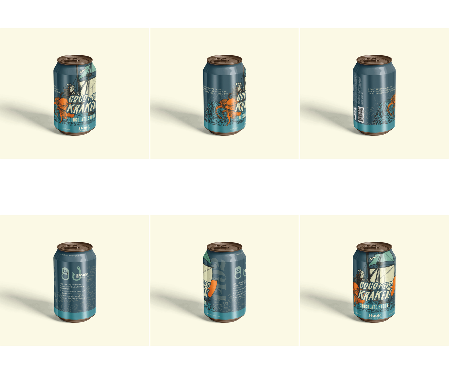
CoCo Meets Kraken is a conceptual craft beer created for Hook Brewing Co., inspired by the controversy surrounding Columbus Day. The concept reimagines Christopher Columbus encountering the Kraken, creating a playful narrative that unfolds through the beer’s name, illustration, and packaging.
The illustration places Columbus at the center of a chaotic encounter with the Kraken, using expressive linework, layered forms, and a nautical palette to create movement across the can. Rather than treating the label as a flat graphic, the composition was developed around the cylindrical form of the package, allowing the story and visual elements to wrap around the can and reveal themselves from different viewpoints.
The packaging extends beyond the primary label to create a more interactive experience. Supporting copy, brand elements, and an illustrated fishing inspired interaction invite the viewer to engage with the can beyond its role as a container.
The result is a packaging concept where narrative, illustration, and physical form work together to turn a single product into a small, immersive experience.
The illustration places Columbus at the center of a chaotic encounter with the Kraken, using expressive linework, layered forms, and a nautical palette to create movement across the can. Rather than treating the label as a flat graphic, the composition was developed around the cylindrical form of the package, allowing the story and visual elements to wrap around the can and reveal themselves from different viewpoints.
The packaging extends beyond the primary label to create a more interactive experience. Supporting copy, brand elements, and an illustrated fishing inspired interaction invite the viewer to engage with the can beyond its role as a container.
The result is a packaging concept where narrative, illustration, and physical form work together to turn a single product into a small, immersive experience.


Print Design
This collection brings together marketing collateral created for businesses across a range of industries, each with its own audience, goals, and visual language.
From brochures and promotional materials to direct mail, signage, presentations, and digital assets, each piece was developed with the larger brand system in mind. Rather than treating individual deliverables as isolated graphics, the work considers how typography, imagery, hierarchy, scale, and composition work together to create consistency across multiple touchpoints.
The projects also explore how a brand changes as it moves between formats and environments—from something held in the hand to something experienced at a larger scale. This attention to context allows each piece to feel connected to the larger identity while remaining purposeful within its specific setting.
Together, the work reflects an approach to marketing design that balances clear communication with thoughtful visual systems, creating materials that are designed not only to inform, but to shape how a brand is encountered.
From brochures and promotional materials to direct mail, signage, presentations, and digital assets, each piece was developed with the larger brand system in mind. Rather than treating individual deliverables as isolated graphics, the work considers how typography, imagery, hierarchy, scale, and composition work together to create consistency across multiple touchpoints.
The projects also explore how a brand changes as it moves between formats and environments—from something held in the hand to something experienced at a larger scale. This attention to context allows each piece to feel connected to the larger identity while remaining purposeful within its specific setting.
Together, the work reflects an approach to marketing design that balances clear communication with thoughtful visual systems, creating materials that are designed not only to inform, but to shape how a brand is encountered.


Medusa Chocolate
Medusa Chocolate is a conceptual dark chocolate brand inspired by the drama, symbolism, and visual language of Greek mythology. The packaging was designed to turn each bar into a small piece of the story, using illustration and visual character to create a sense of discovery before the product is ever opened.
Each flavor is given its own illustrated narrative. Sea Salted Dark Chocolate draws on the power and movement of the sea, while Raspberry Dark Chocolate introduces Medusa through an expressive portrait surrounded by serpentine forms. Distinct color palettes help differentiate the flavors while a shared navy, gold, and Greek key system ties the collection together.
The packaging balances classical references with a contemporary approach to composition, typography, and illustration. The result is a collection designed to feel collectible and immersive where the package becomes part of the experience rather than simply a container for the chocolate.
Each flavor is given its own illustrated narrative. Sea Salted Dark Chocolate draws on the power and movement of the sea, while Raspberry Dark Chocolate introduces Medusa through an expressive portrait surrounded by serpentine forms. Distinct color palettes help differentiate the flavors while a shared navy, gold, and Greek key system ties the collection together.
The packaging balances classical references with a contemporary approach to composition, typography, and illustration. The result is a collection designed to feel collectible and immersive where the package becomes part of the experience rather than simply a container for the chocolate.


TerraSur
Terra Sur is a Peruvian restaurant in Carrollwood, Florida, inspired by the rich visual language, landscape, and cultural history of Peru. The rebrand was approached as more than a new identity, it was an opportunity to create a sense of place and carry the story of the restaurant throughout the dining experience.
The identity centers around a custom mark inspired by traditional Peruvian masks, paired with custom typography and a warm copper tone that gives the brand a refined, tactile quality. Topographical maps of Peru became a recurring graphic element, extending across the restaurant’s walls, planting pots, menus, and other touchpoints.
Warm color, ambient lighting, natural forms, and layered graphic elements work together to create an environment that feels intimate, welcoming, and connected to its inspiration. The custom wine label completes the experience, bringing the visual language of the space back into the hands of the guest.
The result is a cohesive identity designed to be experienced at multiple scales from the details of a menu or wine bottle to the larger environment surrounding the guest.
The identity centers around a custom mark inspired by traditional Peruvian masks, paired with custom typography and a warm copper tone that gives the brand a refined, tactile quality. Topographical maps of Peru became a recurring graphic element, extending across the restaurant’s walls, planting pots, menus, and other touchpoints.
Warm color, ambient lighting, natural forms, and layered graphic elements work together to create an environment that feels intimate, welcoming, and connected to its inspiration. The custom wine label completes the experience, bringing the visual language of the space back into the hands of the guest.
The result is a cohesive identity designed to be experienced at multiple scales from the details of a menu or wine bottle to the larger environment surrounding the guest.


USFG&D
The USF Graphic Arts & Design poster series explores the relationship between graphic form and place, using the Bauhaus movement as a foundation for interpreting the architecture and character of downtown St. Petersburg.
Minimal geometric forms, blocks of color, and expressive linework were used to reduce elements of the surrounding environment into a series of bold graphic compositions. The designs reference the downtown landscape and the location of the Graphic Arts building, creating a visual connection between the program and the place it inhabits.
The system was then extended beyond the posters through a series of coaster handouts, giving the identity a smaller, more tactile format and allowing the visual language to move into the spaces where students and visitors interact.
The result is a flexible graphic system that connects place, architecture, and communication, using visual abstraction to create a recognizable sense of location across different scales and physical touchpoints.
Minimal geometric forms, blocks of color, and expressive linework were used to reduce elements of the surrounding environment into a series of bold graphic compositions. The designs reference the downtown landscape and the location of the Graphic Arts building, creating a visual connection between the program and the place it inhabits.
The system was then extended beyond the posters through a series of coaster handouts, giving the identity a smaller, more tactile format and allowing the visual language to move into the spaces where students and visitors interact.
The result is a flexible graphic system that connects place, architecture, and communication, using visual abstraction to create a recognizable sense of location across different scales and physical touchpoints.
bottom of page